BEATZY
A landing page that sells the feeling, not the spec sheet.
BACKGROUND & CONTEXT
Audio product pages default to safe white layouts and predictable grids. They communicate specs but never communicate feeling.
TARGET USERS
Buyers of premium consumer audio
THE GOAL
Make a product page feel like the product sounds.
MY PROCESS
- Visual direction
- layout
- UI
KEY DECISIONS
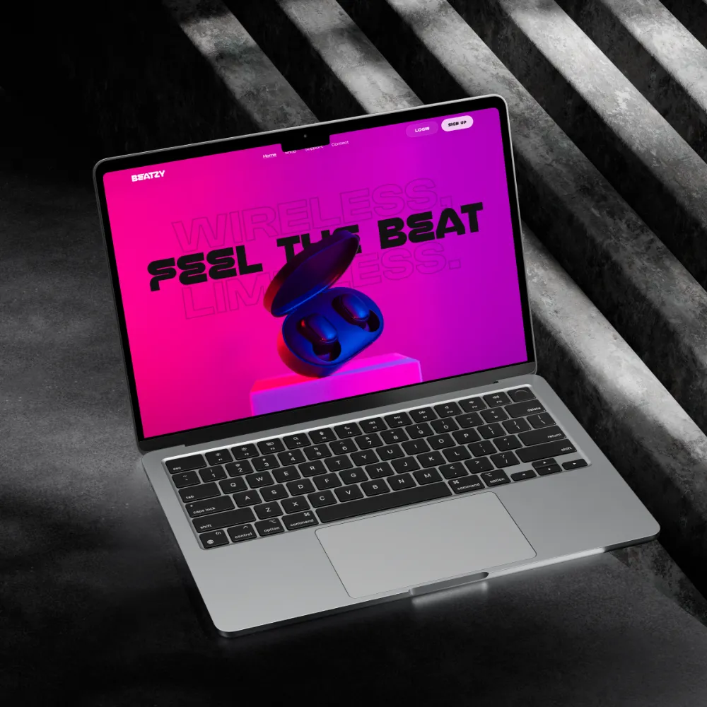
- Dark, high-contrast palette with neon gradients
- Bento feature grid instead of uniform card rows
- Editorial typography at oversized scale
THE SOLUTION
An immersive hero with layered imagery and oversized typographic contrast, a bento-style feature grid, glassmorphism product cards and a consistent magenta-to-purple gradient system.
KEY FEATURES
- Immersive hero
- Bento feature grid
- Glassmorphism product cards
- Neon gradient system
DESIGN SYSTEM & ACCESSIBILITY
Gradient, type and spacing scale applied as one reusable system across the page. Dark high-contrast base; small text set on neon gradients needs a contrast check before publishing.
OUTCOME
A visual-direction piece showing range beyond product UI.
BY THE NUMBERS
A full landing page concept, brief to final UI, in 1 week
What I learned
Restraint in layout is what lets a loud palette work.